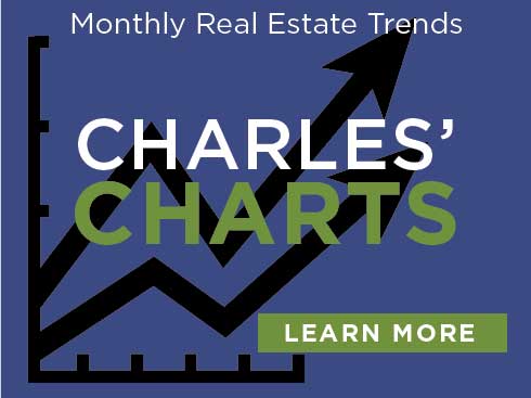
Charles’ Charts! Our Second Edition of local Broker Charles McCann providing monthly Real Estate Trends in charts! These charts provide visuals of all our local changes and statistics. Three charts — click to view each.
List price compared to sold
“My favorite chart is the List Price compared to the Sale Price Chart. This chart demonstrates that you have to be prepared to possibly buy over list price.” – Charles McCann
No. Homes sold 12 months
“Despite low inventory, we are selling more homes now than we did last year, on a 12 month rolling average.
Which means, Buyers be prepared, “Your Desired Home” will eventually come on the market, you had better be ready!” – Charles McCann
Median 3to6 mo Moving Ave
Love this chart! The last 3 months can be seen just as I have been experiencing in the Market! I have had multiple buyers fighting to stay in certain neighborhoods, but were feeling like they were getting priced-out. These last 3 months and 6 months for that matter, have been exceptionally difficult for buyers in the $300,000 to $400,000 Purchase Price range. As you can see, they’re in the mix for median home prices being sold, so there are the most home buyers competing for very low inventory